Note: I have a backlog of draft articles from before I added prism.js code block syntax highlighting to my blog. This one is from the Scrimba UI Design course by Gary Simon in January 2023.
January 06, 2023
Lately, I’ve been focusing on improving my web development skills with smaller, shorter term goals. For the past couple of weeks that focus has been on css and design, specifically on completing the css parts of the Scrimba Frontend Developer Career Path and continuing to finish Gary Simon’s UI Design course. There’s some overlap between the two, but the UI Design course is significantly longer and goes much deeper into design concepts and and further by covering gradients, form design, and UI animations.
The Starter Code
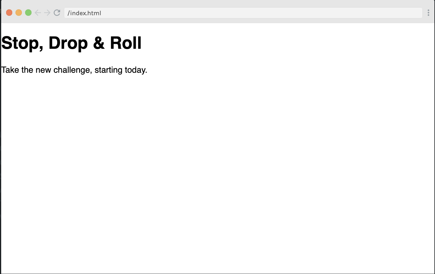
Today, I finished the “build a simple layout” section. The starting webpage and code had just one h1 and a single sentence paragraph (see below).
<html>
	<head>
		<link rel="stylesheet" href="index.css">
	</head>
	<body>
		<div class="container">
			<h1>Stop, Drop & Roll</h1>
			<p>Take the new challenge, starting today.<p>
		</div>
	</body>
</html>
@import url('https://fonts.googleapis.com/css?family=Montserrat:400,700&display=swap');

html, body {
	margin: 0;
	padding: 0;
}
The initial webpage looked like this:

The task was to use css and one image to create a two column grid layout for desktop while paying attention to the elements of UI Design:
- White Space
- Color
- Contrast
- Scale
- Alignment
- Typography
- Visual Hierarchy
Step One: Choose a Background Image
The first step was to choose an image. Two images were provided, but I took Gary’s suggestion to find one on unsplash.com. I’m into skating, so the word “roll” in the h1 made me think of roller skating. I found a great image by Logan Weaver of a woman roller skating in a a skate park. After trying it out in the project, I realized I wanted to change the colour balance, and did that with the tools in the Photos app on my MacBook.
To adjust the colour of an image using Apple Photos in MacOS:
- import image to Apple Photos
- double click image - click on “edit” in upper right hand corner
- you’re now in the adjust window
- I choose colour, and used the most greyed out option
Step Two: Set up the Body and Two Column Grid Layout
I chose to use css grid for this mini-project instead of flexbox as it’s on my “to get better at” list this month. Adding the image as the background, and setting background-size to cover causes the image to cover the entire screen - no matter what the viewport height or viewport width is.
For the container class a large margin-left of 4.5rems pushes the container over to the right. Two grid-template-columns of 1.75fr and 1.25fr give the h1 a slightly larger horizontal area than the paragraph. This establishes visual hierarchy - one of the X principals of UI design - between the two text elements. A single row keeps everything aligned.
body {
	font-family: 'Montserrat';
	background: #000 url('logan-weaver-lgnwvr-FvxU8FboUdE-unsplash.png');
	background-size: cover;
}

.container {
	margin-left: 4.5rem;
	display: grid;
	grid-template-columns: 1.75fr 1.25fr;
	grid-template-rows: 1fr;
}
Final Code
The only change to the html was putting a break after the comma in the paragraph. This lets the text wrap at the best point for readability.
The H1
Font size for the h1 was set to 3.5rem, and aligned to the right. This puts it at the top of the visual hierarchy in size, and in position with it being the first thing a user sees when reading from left to right. The dark crimson colour was chosen to standout from the background, while still staying in the pink single colour theme. A grey drop shadow was added to help the header standout, while smoothing the edges into the greyscale background image.
A border was added to the top and left, again to help the header standout. A large border radius of 25px on the top left corner reflects the “roll” and the curves of the skatepark ramps. The border colour was taken from the actual photo after the image transformation on my MacBook Photos app.
Paragraph
Much of the css for the paragraph was coded to establish visual hierarchy between the paragraph and the h1.
- text-transform: uppercase - makes the text easier to read and keeps it distinct in style from the h1
- margin-top: 10rem - pushes the paragraph down below the line where the h1 starts (Alignment)
- font-size: 1.2rem - a little bigger than what the body text would be, yet very different in size from the h1 - again maintaining the visual hierarchy
- color: black (#000) - again this keeps the paragraph lower down in the visual hierarchy than the h1. Black and grey are the neutral colours in this pink theme.
- text-shadow: 1px 1px 2px darkgray - this is similar but smaller and darker than what is applied to the h1. (Uses scale to reinforce visual hierarchy)
- padding: 2rem - this gives the text “room to breathe”.
- font-weight: bolder - places visual emphasis on the text, which helps it standout against the grey background.
Pink-Border-1 Class
A pink border matching the left and top one around the h1 was added to the paragraph. A margin-right of 3rem gives room between the border and the paragraph text. Sufficient white space spacing helps improve readability and keeps the design uncluttered.
…
<html>
	<head>
		<link rel="stylesheet" href="index.css">
	</head>
		<body>
			<div class="container ">
				<h1>Stop, Drop, & Roll</h1>
				<p class="pink-border-1">Take the new challenge, <br>starting today.<p>
			</div>
	</body>
</html>
@import url('https://fonts.googleapis.com/css?family=Montserrat:400,700&display=swap');
html, body {
margin: 0;
padding: 0;
}
body {
font-family: 'Montserrat';
background: #000 url('logan-weaver-lgnwvr-FvxU8FboUdE-unsplash.png');
background-size: cover;
}
.container {
margin-left: 4.5em;
height: 100vh;
display: grid;
grid-template-columns: 1.75fr 1.25fr;
grid-template-rows: 1fr;
}
h1 {
font-size: 3.5rem;
text-align: right;
border-top: 4px solid #e8aeb9;
border-left: 4px solid #e8aeb9;
border-top-left-radius: 25px;
color: #9c0d78;
padding: 1em;
text-shadow: 2px 2px 3px grey;
}
p {
text-transform: uppercase;
font-size: 1.2rem;
margin-top: 10rem;
text-align: left;
color: #000;
text-shadow: 1px 1px 2px darkgray;
padding: 2rem;
font-weight: bolder;
}
.pink-border-1 {
border-bottom: 4px solid #e8aeb9;
border-right: 4px solid #e8aeb9;
border-bottom-right-radius: 25px;
margin-right: 3rem;
}Given that the code is simple, I chose to deploy this mini project as a public “scrim” on Scrimba.com
